Wastyd

Design Overview
Timeline: 5 weeks
Team: Wastyd is an ongoing individual project, though I received the feedback of a small group of UX Designers and product managers to better refine it.
Tools Used: Mural, Figma, Illustrator, Qualitative and Quantitive Research, Paper Prototyping
Outcome: I designed a mobile app that will use a chat function (NPL) and a camera scanner (M/L) to help users understand what they can recycle, how they can recycle it, no matter where they are.
Try the Prototype
The Problem
Before viewing this video from Vox, I thought I was the only one confused about what I could and could not recycle. I often threw items into the recycling bin with the hope that they could be recycled. It turns out that action, known as "wishcycling" has huge economic and environmental effects.

Source: Vox
Prior to the 2000s, recycling in the United States was largely pre-sorted and highly constrained. The average contamination rate of recycling, or the rate of non recyclables in recycling bins was extremely low, but as single stream programs increased in the US, so did contamination. This contamination forces otherwise "clean recyclables" into landfills, creating economic and environmental waste. This led me to this question:
How might we... design a solution that allows people to understand the rules of recycling in their current location so that we reduce the average contamination rate in recycling?
The Process

The Research
Qualitative Methods: 1:1 Interviews and surveys, literature review
Quantitative Methods: Polls
# of Interviewees: I conducted 12 one-on-one interviews.
Sourcing Interviewees: By reaching out to my local county's Facebook group and the Facebook group of an influential blogger, I met a diverse group of potential users. I also did initial outreach to my peer group through Instagram polling both qualitative and quantitative.
Research Goals & Initial Questions
I went into the research process with several goals but open to invaluable insights I may not have expected. My goal was to learn, specifically:
-
Whether the idea of an app was valid.
-
The branding that most resonates with potential users.
-
The specific pain points of potential users.
Therefore some of the questions I asked were the following:
-
Where do you learn how to recycle?
-
Has the way you recycle changed over time?
-
Which influencers or brands who you follow that you associate with being "green" or being "sustainable"?
User Insights
During my ongoing research several pain points surfaced. And from those, I developed a few goals for the solution.
Pain points derived from User Interviews
-
The way people receive recycling information is from multiple, sometimes conflicting, sources.
-
People are too busy and recycling is now too nuanced to know how to quickly recycle correctly.
-
Recycling information isn’t clear, simple, or consistent across cities.
User Goals
-
User wants to get recycling information from one source
-
User want to determine how to recycle in a more efficient and accurate way
-
Users want recycling information that's clear, simple, and location-specific.

After extensive research, I realized my target users were a lot like Pamela and Maria.


Competitive Analysis
At this stage I had some ideas about what a solution could look like, but I also checked the landscape of competitors to make sure it would be both different from other market offerings while also solving user’s pain points.
In the app store, I found games, municipally connected apps, apps with categorized searching. Each had strengths and weaknesses. Google Lens and cash reader apps for the blind were also interesting as inspiration for a search tool.
Beyond apps, I researched services like boutique pick up laundry services, disposal pick up services, and niche recycling and reuse services, like, Loop and Terracycle. Municipal services also had their own tools but often lacked personalization and didn't address my need for a location specific tool.


Source: The Verge

Source: CNN.com
Source: Recycling Coach
The Ideation
The stages of my design process overlapped. While I had initial ideas, as I learned more from interviews, I uncovered new ideas. At a point, it was necessary to categorize them, and a few larger ideas surfaced.
While a modified recycling bin would be more feasible it would not be as impactful as a boutique pick up model or app. In the end, the app won out given how much more feasible and more potentially impactful it would be.
Major ideas:
-
A physical recycling bin or attachment
-
A boutique/niche curbside pick up service model
-
A digital app for recyclers
"In the end, the app won out given how much more feasible and more potentially impactful it would be."


The Prototype
Styling the App
Since recycling products and services often used the same branding, it was important to differentiate this app.
Typography - I used Fenway for the logo, Degular for headers, and SF Pro Display for copy. It was important to mix past and present, visual interest with simplicity, and I think this combination achieved it.
Color Scheme - This is reminiscent of Woodsy the Owl and Smokey the Bear posters.
These figures are icons of environmental conservation, especially in the 1960's and 70's. I made the colors richer, more contemporary than those on the older posters. I wanted resist the more ubiquitous recycling green and blue and move toward a color scheme that’s more visually interesting but still earthy. This color palette equally corresponded to the brands and influencers Maria was following that represented to her values like sustainability.

Low-Fidelity
I created wireframes and eventually a paper prototype. Before taking them digitally into Figma, I put them in front of several potential users.
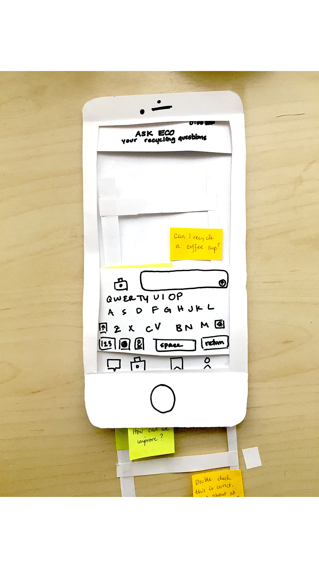

Here's what users told me about the low-fid prototype (or what I inferred)...
-
Users said that she would only use location settings on setup and did not want to set her location each time she entered the app.
-
Chat was the least obvious way to check if something is recyclable.
-
User was looking for a recent searches section for items.
-
One user travelled often and needed the app to determine her location rather than her constantly inputting it.
-
Given user's likelihood to share information about recycling with others, it was imperative to have a sharing functionality.
-
Given the specificity of user's recycling needs it was important that they have a way to save their most used items.
Wastyd in Action
The insights I gained from usability testing and my user personas contributed to the high-fidelity version of the app, which you can see in action below.
Getting Started
Onboarding Function
Because some functionalities of the app were not clear to users, it was important to allow for an onboarding process. This process shows users what the app is used for before the sign up. Once inside the app, users are guided through setting up their location and notification preferences. They’re also given the option to be told what to expect from each app screen to increase their understanding and get started faster.
NPL
Chat Function
Chat bot using natural language processing/database of item-specific recycling information is available through some city recycling programs, but not all. This is functionality for multiple cities within one app is feasible and offers high impact. This flow allows users to save, share, and provide feedback on recycling guidance provided for specific localities to better provide guidance to constituents.
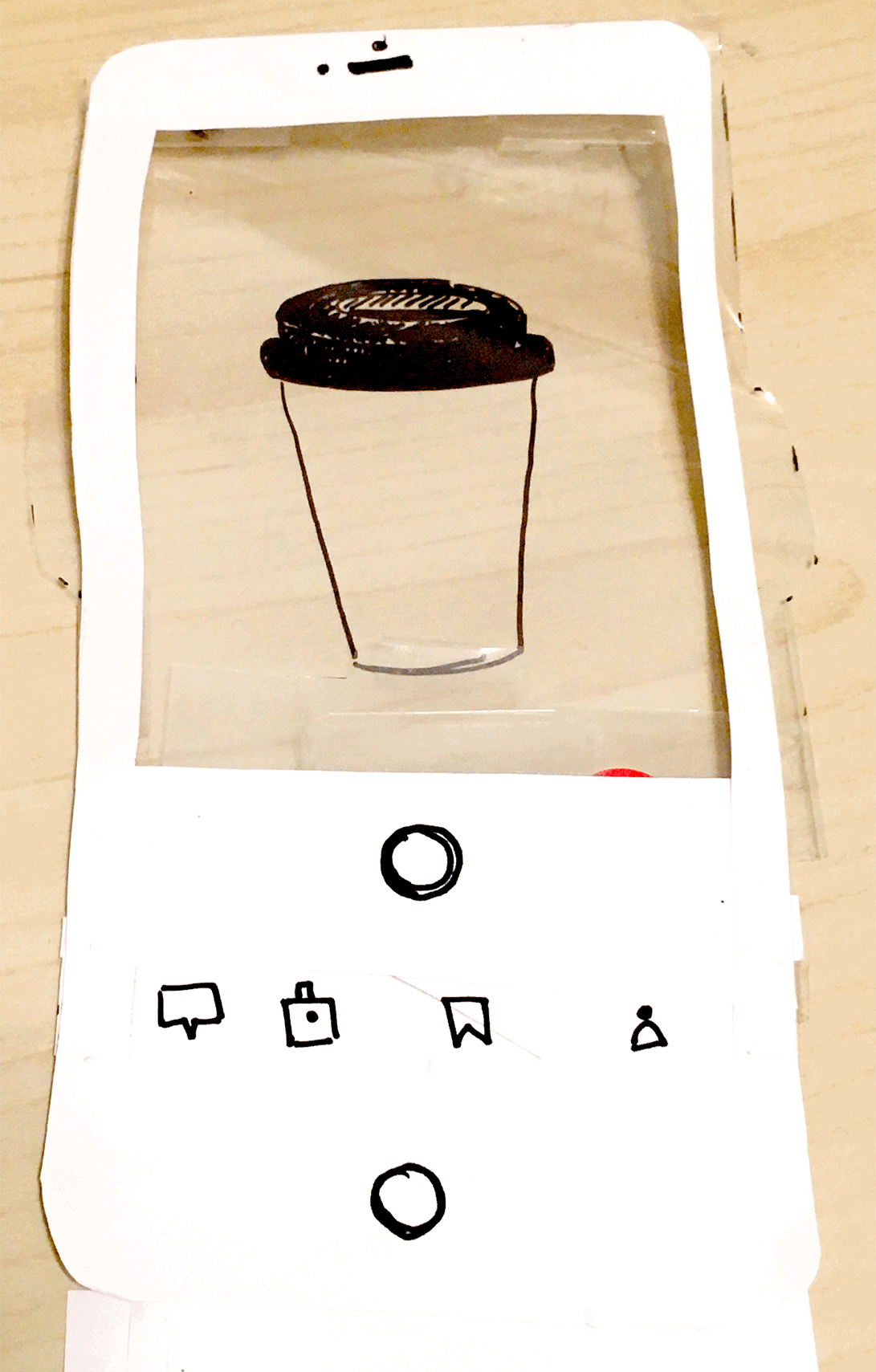
M/L
Camera Scanning
M/L has use on apps like Google Photos, Cash reading apps for the blind, leaf identification apps, and Pinterest. M/L is not currently being used for consumers in recycling apps but it is available for waste management company robots that do a cursory sort of trash. (mid-feasibility and high impact).
Personal Journey
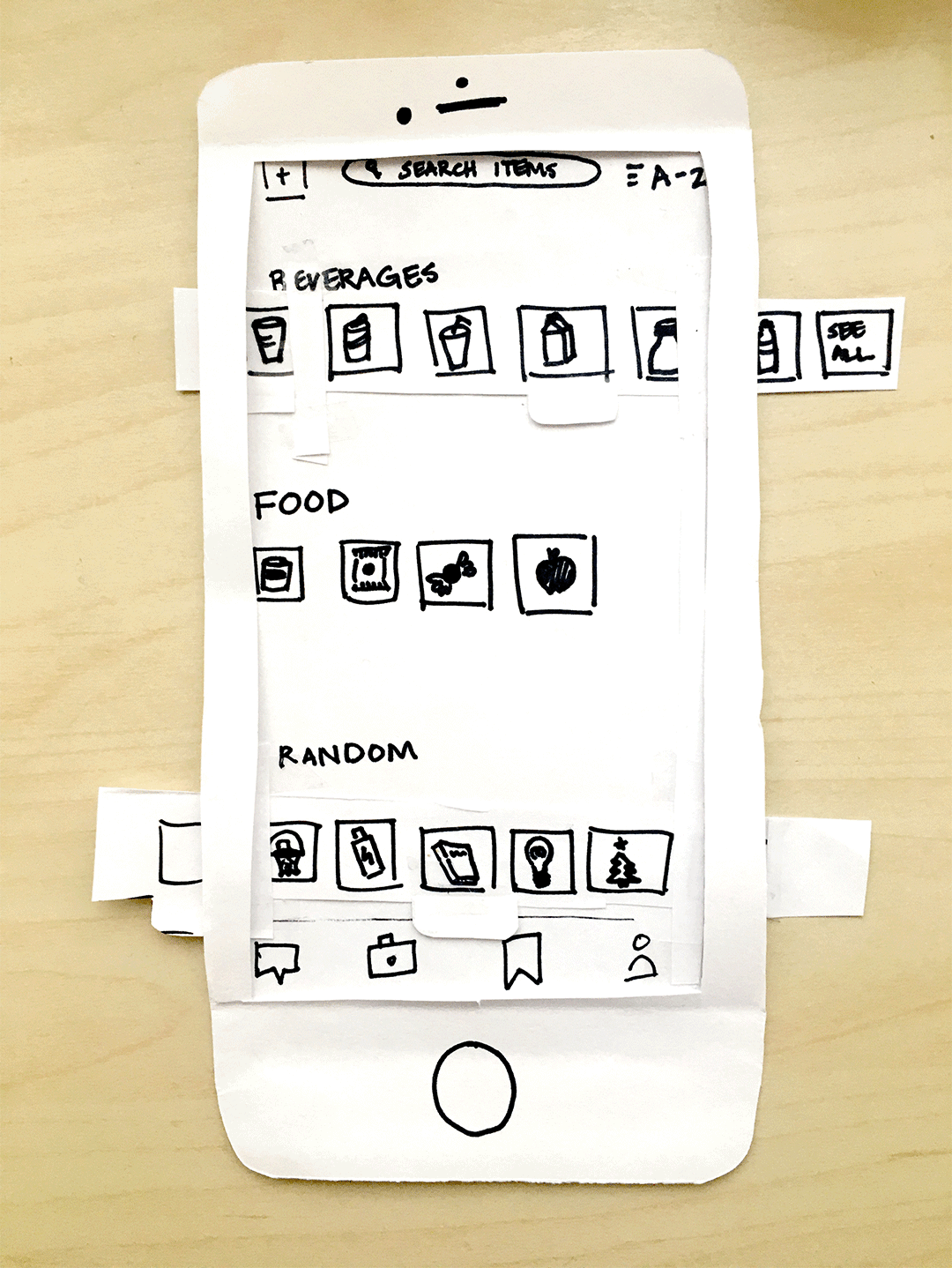
Profile
The profile separates the items that you care about from all of the preset items available in the app. Start new collections, organize your existing collections, but also have easy access to new items that you made have been curious how to recycle.
Lessons and Next Steps
Lessons
-
Components, Components, Components - My UI ability greatly improved, especially by leaning on creating structured designs with Figma's component functionality.
-
Take what users say with a grain of salt - Especially because of the opportunity to tie morality to the act of recycling, I was careful to probe interviewees with questions regarding "how and why" especially when people's recycling habits seemed too ideal.
Next Steps
-
Testing - Getting the high-fidelity prototype in front of potential users I'll test the Profile Feature and the validate whether there's a need or significant benefit to requiring an email address to use the app.
-
Interviewing - While I spoke mostly to potential users, I had not yet spoken to municipal waste management staff who might have their own pain points or regulations of which I should be aware.
-
Feasibility of M/L - Embedding M/L into an app is likely more difficult than a chat bot. That said, it will be important to test the relative benefit of a M/L camera scanner versus a chat bot with potential users.
